##Introduction I've long been fascinated by how complex behaviour can manifest from very simple rules, and there's no greater exemplar of this than the classic Mandelbrot set (https://en.wikipedia.org/wiki/Mandelbrot_set)
The Mandelbrot set is defined by the iteration:
where and is a complex number.
Just repeat the iteration a few hundred times for a fixed value of and you'll quickly see the result either runs off to infinity, or converges to a number (or more correctly is bounded). If it converges, color the point black as it belongs to the set; if it escapes, it's not, so give it a colour. And for added visual flashery, you could use a colour gradient to show how quickly the number reaches infinity. Repeat for all values of across the real-imaginary number plan, and you have your pretty picture!
Worked examples:
- : the sequence is 0, 1, 2, 5, 26, ... so escapes to infinity => give it a colour;
- : the sequence is 0, 2, 6, 38, 1446, ... so escapes to infinity => give it lighter colour (as it's escaping quicker);
- : the sequence is 0, −1, 0, −1, 0, ... so it belongs to the set, so colour it black.
Implementation
I was thinking about how to implement this in python code, and decided to sit down and give it a try. Surprisingly, 15mins later (without ChatGPT), I had a working proof-of-concept.
It's long since lost the code so just asked ChatGPT to generate (there's countless examples on the internet). To making it a little more interactive, I'm executing the code as cells in a jupyter notebook (renders the images inline within the browser), and playing around with the parameters until I find a picture I like
Color scheme maps iteration count to Viridis colormap for smooth gradients.
import numpy as np
import matplotlib.pyplot as plt


def mandelbrot(x_min, x_max, y_min, y_max, width=800, height=800, max_iter=200):
    """
    Compute escape velocity (iterations to escape) for the Mandelbrot set
    on a rectangular region of the complex plane.

    (x_min, x_max) ≡ (x, x')
    (y_min, y_max) ≡ (y, y')
    """

    # Create a grid of complex numbers c = x + i y
    xs = np.linspace(x_min, x_max, width)
    ys = np.linspace(y_min, y_max, height)
    C = xs[np.newaxis, :] + 1j * ys[:, np.newaxis]

    # Start with z = 0 everywhere
    Z = np.zeros_like(C, dtype=np.complex128)

    # This will store the escape velocity (how fast each point escapes)
    escape_velocity = np.zeros(C.shape, dtype=int)

    # mask == True means "this point is still being iterated"
    mask = np.ones(C.shape, dtype=bool)

    for i in range(max_iter):
        # z_{n+1} = z_n^2 + c   (only for points that haven't escaped yet)
        Z[mask] = Z[mask] ** 2 + C[mask]

        # Points with |z| > 2 are considered "escaped"
        escaped_now = (np.abs(Z) > 2) & mask

        # Record at which iteration they escaped
        escape_velocity[escaped_now] = i

        # Stop iterating those points
        mask &= ~escaped_now

    # Points that never escaped get the maximum value
    escape_velocity[mask] = max_iter

    return escape_velocity


def plot(x_min=-2, x_max=0.5, y_min=-1.25, y_max=1.25, width=1000, height=1000, max_iter=200):
    '''
    plot(x_min=-0.0775, x_max=-.0725, y_min=0.658, y_max=0.664, width=2000, height=2000, max_iter=200)
    '''
    escape_velocity = mandelbrot(x_min, x_max, y_min, y_max,
                                 width=width, height=height,
                                 max_iter=max_iter)


    plt.figure(figsize=(10, 10))
    plt.imshow(
        escape_velocity,
        cmap="viridis",                 # blue-green-yellow colormap
        extent=[x_min, x_max, y_min, y_max],
        origin="lower"
    )
    plt.xlabel("Re(c)")
    plt.ylabel("Im(c)")
    plt.title("Mandelbrot set (colored by escape velocity)")
    plt.colorbar(label="Iterations before escape")
    plt.show()

plot(x_min=-0.0775, x_max=-.0725, y_min=0.658, y_max=0.664, width=2000, height=2000, max_iter=200)
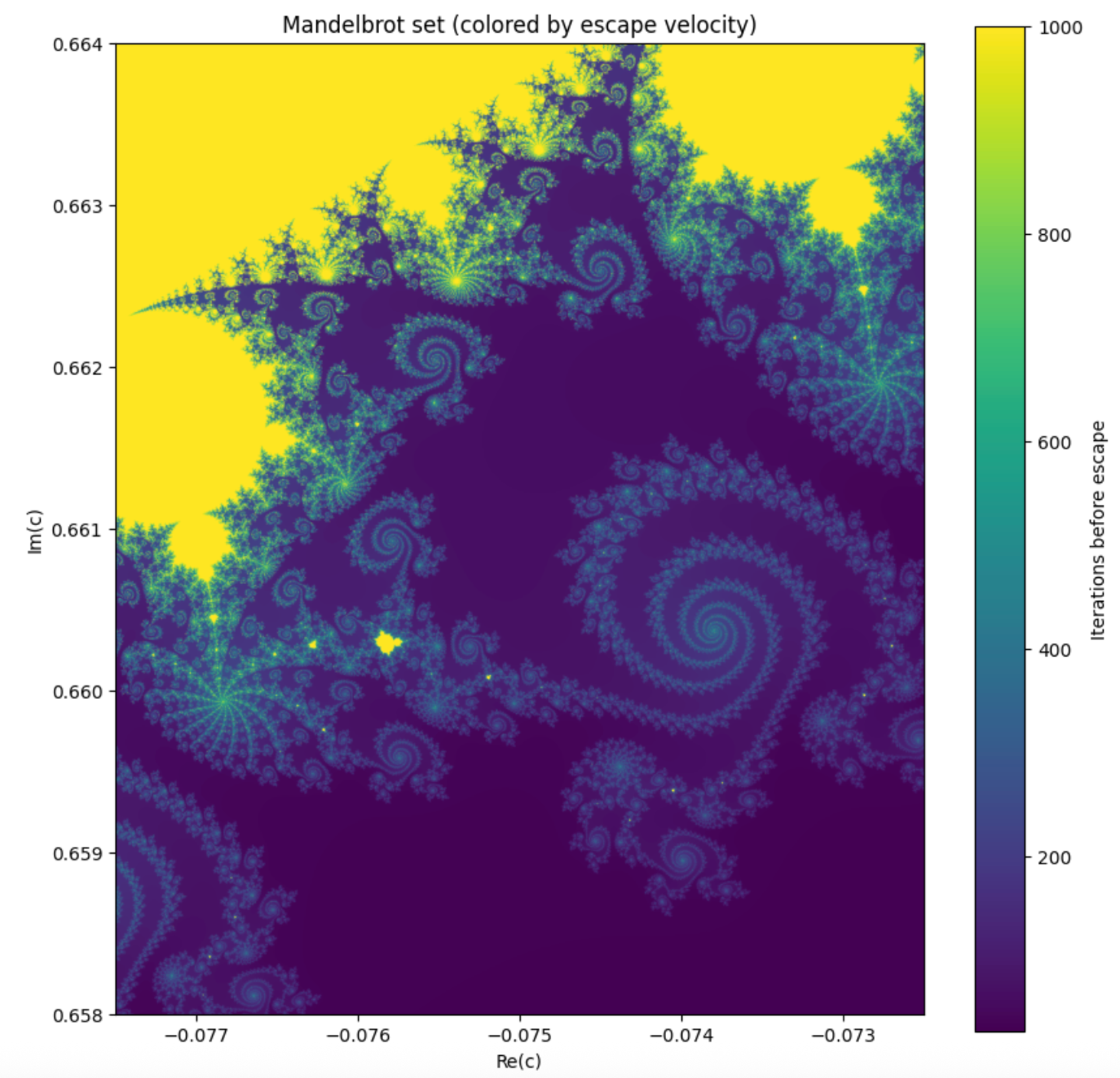
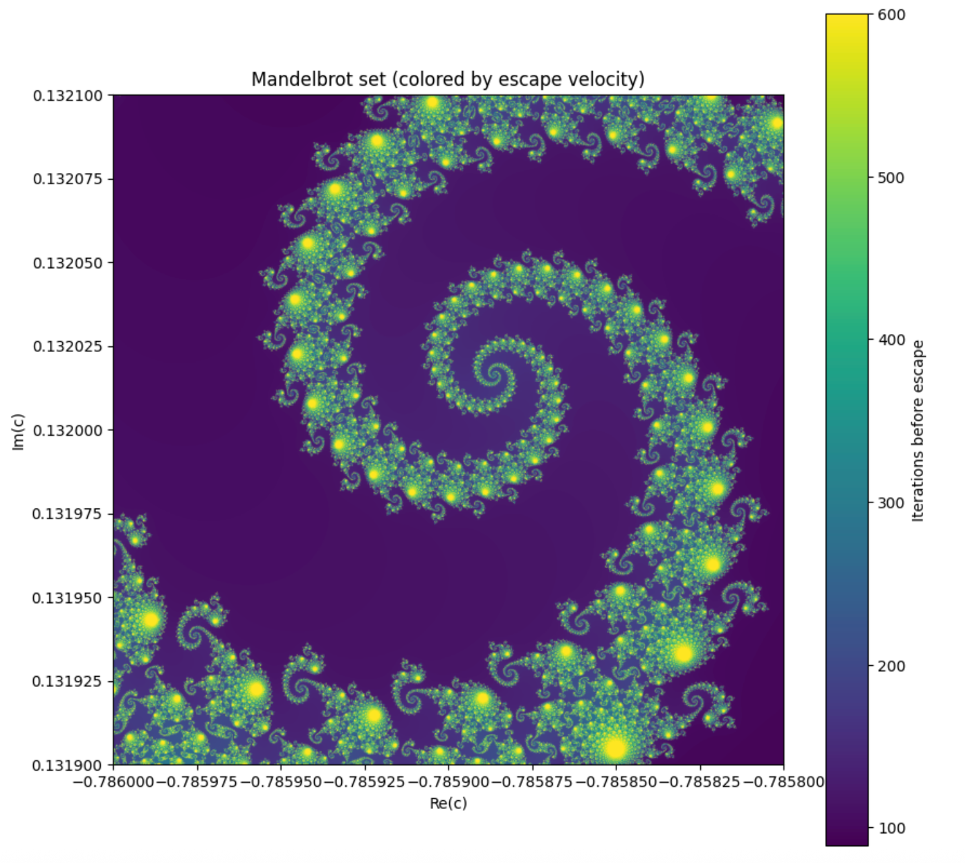
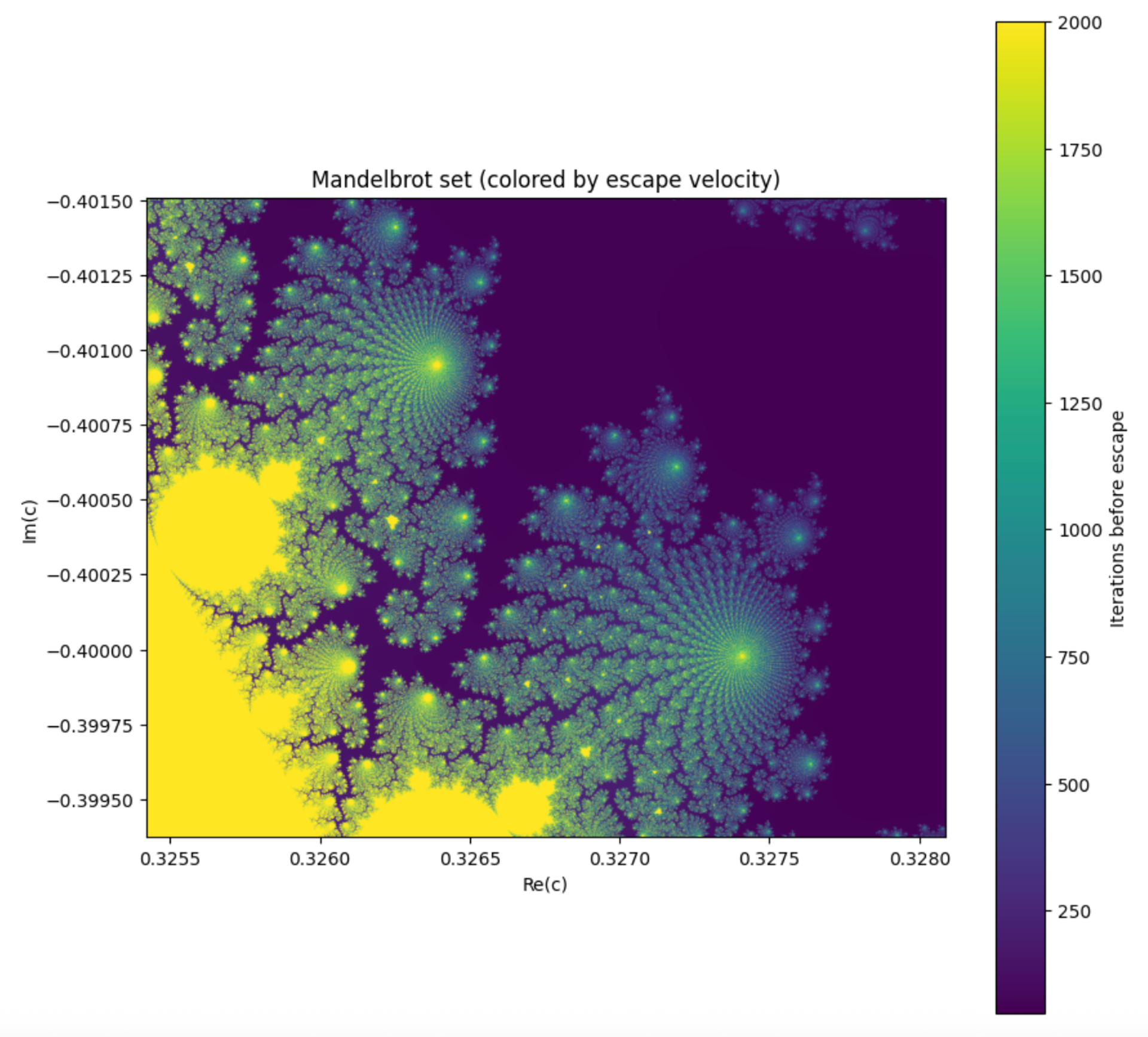 I used the following parameters for the above plots:
plot(x_min=-0.0775, x_max=-.0725, y_min=0.658, y_max=0.664, width=2000, height=2000, max_iter=1000)
plot(x_min=-0.786, x_max=-0.7858, y_min=0.131900, y_max=0.132100, width=2000, height=2000, max_iter=600)
plot(x_min=0.3254211097955704, x_max=0.32808712869882584, y_min=-0.3993731737136845, y_max=-0.4015094414353375, width=2000, height=2000, max_iter=2000)
For a much better and interactive implementation, check out https://mandelbrot.site/ by ross@rosshill.ca